Posts

The Nature Man

Image
Photoshop Challenge Original Ideas Before On day one of the challenge we were introduced to a video explaining rules, and what the main objective was. When going through it, we were required to use a picture of a man with a blank background, then integrate parts of nature into the image itself, but we were to keep the textures of the image when doing so. Int eh video, he showed us versions with trees protruding from his head, and roots and soil made up his suit. I wanted to make my version of the project look similar originally, but lost the idea after thinking back to a cooler theme, one with ice, frost, snow, and polar-based trees. But of course, as with most projects in the learning stage, the idea had major complications and reworks. Starting Off To begin the challenge, I loaded the image above into photoshop and began brainstorming more specific ideas for what I wanted. What time of day would it be? Do I want objects protruding from the main borders of the man himse...
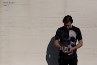

Photo Editing

Image
Editing in Photoshop Prior Knowledge, and New Tricks At the beginning of this school year I am beginning to learn more to photoshop than what I had left off with. Last year, coming in as a Freshman, I designed and sequenced a bouncing ball animation to get a few tools under my fingertips. Now, a year later, I am in Graphic Design, and learning more about how to apply the prior knowledge I had, and combining it with what we are learning to remove any unwanted scenes or objects from pictures. As we are given a series of video how-to's to watch, we use new tools and lean when, and how, to apply them. These tools range anywhere from the move tool and down to the clone stamp tool until we eventually combine all of the new information to create a portfolio (with preset pictures). Content-Aware Fill Originally had several marks and bolts This can be activated through a few areas in the toolbar, such as the lasso tool, and when deleting an unwanted object like a bolt, or scrat...

An Outlook on e9

Image
What Quarter 4 Looked Like... For the fourth and final quarter of e9, we were assigned different teams to work with based around what our various personality types are (ones discussed in a previous post). Once situated with each other, and finishing introductions, we were to begin brainstorming a product, and other aspects associated with it, such as a logo and a slogan. Eventually, we had developed LI: Language Interpreter. It is a product that connects a pair of glasses to an earpiece, and can translate audible or written language into your ear, as well as speak to someone in an appropriate response to a situation. To complete everything from brainstorming to completing a full-blown website took my group the entirety of the time we had in class, as well as a couple of occasions where we had to come in during our lunch, or before school. Along the way however, was not easy, as we all had similar yet very different personalities and opinions. To cope with this we all threw our idea...

CSS and CARP Design

Image
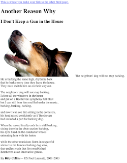
At a Glance Between the two html files, there are evident differences. This includes the background color, text font, size, and color, as well as some layout changes. Then to finish off the project, I added in a link at the top of the page, so that there could be a better comparison between the start and finish. The information that was processed or added into the page would be put into different layout files, so each section would be altered rather than individually bringing out the sections that are wanted to be changed.                                                                    Contrast The website contrasts consist of the heading, subheading, and body paragraphs. The way contrast was used was by changing the color as well as font size, to lead the eye from the more important parts to the actual cont...

My Personality Type

Image
My Myers-Briggs Personality Type After taking a test (Jung Typology Test) that had a variety of questions regarding my reactions to a series of events, I was given a four letter personality "combination." At that time I had no clue as to what it meant, I only saw percentages and words beside them. It stated that I was an INTP, or in other words, someone who spends time thinking, and focuses on the concepts of things, rather than hard evidence and facts. A couple of people who supposedly share this personality type would be Abraham Lincoln, as well as Albert Einstein.  How Well Does This Apply to Me? As I read through several websites explaining what an INTP is, I began to think more and more about it and found it as extremely accurate when compared to me. It also helped reveal several of my "mysteries" about why I act the way I do, as well as the way I think. Overall, it felt revealing and when going into a deeper thinking about some of the sections, it ...

Logo Designing

Image
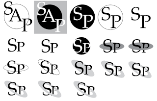
Brainstorming and Beginning As I have quickly found out throughout my way to create my logo, designing one is much slower than it looks. To put down all of my initial ideas on paper, it took a total of three days, three days of creating new designs, re-creating old ones, and completely scrapping some of them in general. And the interesting piece is, if I started instantly on Adobe Illustrator, I would find myself stuck. The ability of pencil and paper is that you can constantly improve upon ideas you have or had, and change things around quicker, sooner, and without dedicating too much time to developing it. After this time had ended and I ran dry of ideas, I circled my best three and was given advice upon what I could do to improve each, as well as which ones were the strongest.  Designing and Executing After all of the previous events, it was time to form them on-screen, but the brainstorming didn't cease completely. When drawing up one of the logo ideas, there were ways...

A Poster for Oz

Image
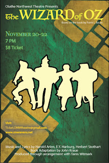
Using CARP to Create a Poster Contrast- Using various sizes and fonts to catch the viewers attention. "The Wizard of Oz" was left as the biggest text on the poster.  The image has contrasting colors compared to the background. Groups of text have a different color based on their subject. Groups of text have different sizing based on importance. Alignment- Keeping lines or images on the same line or axis. The title, studio, details, and information all line up with each other.  The end of the title and the author are aligned. Repetition-  Repeated design ideas. Text groups are small and apply to a specific topic. Lines of three are used in each text group. Different colors apply to a different topic or area of interest. Proximity- The space and grouping between everything. The title, studio, and author are all close together to represent their close ties. All text groups have similar spacing between lines.  Space between ea...