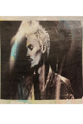
Highlighted Graphic Design Projects Photoshop Challenge #1--"Nature Man" At the beginning of the year, we were re-introduced to Adobe Photoshop, and had to go through several tutorials to enhance our understanding and capabilities with the software. After these were finished, the class was tasked to use our abilities to create the "Nature Man." This project took about 8 days to complete, start to finish, with a few minor complications in between. These include masking problems, effects errors, and a few visual difficulties in the end. However, I learned how to alter the appearance of the image, without taking away the textures of the original image itself, as well as using some complex effects to complete the hair. Along the way however, I was given advice on how to go complete a function in a new manner to save time overall, most of which related back to masking, and how to properly go about it. At this point, I was happy with my overall result, as I had ...
 Alignment- Keeping lines or images on the same line or axis.


Comments
Post a Comment