CSS and CARP Design
At a Glance
Between the two html files, there are evident differences. This includes the background color, text font, size, and color, as well as some layout changes. Then to finish off the project, I added in a link at the top of the page, so that there could be a better comparison between the start and finish. The information that was processed or added into the page would be put into different layout files, so each section would be altered rather than individually bringing out the sections that are wanted to be changed.
Contrast
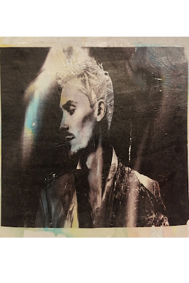
 The website contrasts consist of the heading, subheading, and body paragraphs. The way contrast was used was by changing the color as well as font size, to lead the eye from the more important parts to the actual content. This allowed for the view of the heading, and a way to help intrigue a reader. The image of the dog also aids the process of bringing a reader's eye over the writing piece.
Alignment
Everything within different sections have a different alignment. For instance, the body stanzas or paragraphs are aligned to the left, like any writing portion would be. The image of the dog was aligned to the left to prevent distraction when reading, as well as provide more room for the writing section. The title was centered to act as a "roof" for the content, and as a funnel towards the content below it.
Repetition
 The aspects of repetition in this web project are mainly about the color scheme overall. The dogs colors are often used on the background and the text. For instance, the top html's color was determined with an eyedropper tool by selecting a lighter tan color off of it's fur.
 Proximity
When comparing the final product to the initial one, the proximity between everything changed by a noticeable amount. For instance, the spacing between the heading and stanzas, it grew significantly smaller as the image was moved out of the space between the two, so here is a more fluent or sensible way of reading the poem.


Comments
Post a Comment