The Nature Man
Photoshop Challenge
Original Ideas
 |
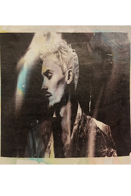
| Before |
Starting Off
To begin the challenge, I loaded the image above into photoshop and began brainstorming more specific ideas for what I wanted. What time of day would it be? Do I want objects protruding from the main borders of the man himself? Do I want multiple images or themes? After a quick process of elimination, I brought my options down to a few images. A glacier, snowy mountain, frost, and snowy trees. From here, I went to unsplash.com to download a few photos for variety, and once again brought them to Adobe Photoshop.
 |
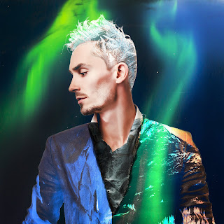
| After |
Creating and Editing
To keep the main textures of the image, I first had to make sure that the imported elemental images had a blending mode on it, that way it would look like a part of the suit or other parts of his body. After that I made a layer mask for every image and erased the parts of the image that I no longer needed, or the overfill. If I want over something that I needed for the essence of the photo, I used the paint brush tool with either a black or white fill o take away or bring back deleted sections, as long as they occurred in the layer mask. However, I changed my theme about halfway through the development process, and decided to go on a path that shares all elements in a way, between cold weather, and infernos. For the ice, I kept the original photo that I was going to use, as well as the frost frost the hair. For the mid-section of the photo, I decided to use a waterfall, and darkened the image to bring out the water more than the rocks beside it. But most interestingly, I kept the snow-cap mountain for the fire aspect I wanted. I made the adjustment layer darken and reverse the colors so much however that it began to look more like a volcano.
Overall
At the end of the time limit, I was incredibly satisfied with my ability to edit the image that was given to me. Although it is not as advanced as the ones shown from the video, I am surprised at what I was able to do. In the future I look forward to be able to learn more about editing, and graphic design as a whole, as well as look back at what I have done to see how far I will go, and how I have advanced as a designer.


Comments
Post a Comment