The Color Wheel, A Graphical Project
Project Factors
At a Glance...
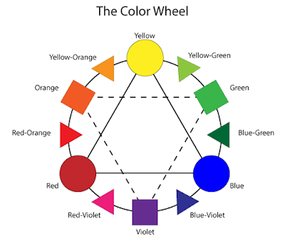
Overall, this project was to help us get accustomed overall to using adobe illustrator. The way that this was done also relates to the learned content over color and schemes. Given this prior knowledge about the color wheel, the hardest part wouldn't be about what color goes where, but rather what tools were needed and how they worked together. This would include all of the shapes seen below, how to change various aspects of the shapes, and finally what text to add (with location).
A New Program...
 In order to bring this idea or assignment into reality, a program called Adobe Illustrator was used. Compared to Adobe Photoshop, Illustrator was better with graphical design overall, leaving photos to it's companion. Here, a variety of tools are at your disposal, and almost all of them have a unique aspect, from making the interior a new color to changing it completely. That's what the basis was, learn what specific tools are and what can be changed about them.
 Personal Review...
Overall, I feel that I learned what Illustrator contained, related to the project at hand, well and was able to carry out needed changes to different aspects as needed. The project completion time was good as it gave me extra time to finish editing recent blogs, and re-adjust various aspects of the project to make it more symmetrical. If told to redo or complete this again, I would change a few things. One would be to use the shortcuts more often, as they would assist with overall production. I would also type in text directly after copying it to another location, to help reduce time clicking and dragging text boxes.


Comments
Post a Comment