Logo Color Schemes
Various Color Schemes for Companies
Analogous
An analogous color scheme consists of three colors that are next to each other on the color wheel.

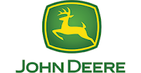
John Deere falls into this category because of it's shadings that help fall into several colors such as green, yellow, and yellow-green. The colors that were used here were probably to give a more visual way to tell that they are a farming or "green" company.

PetroChina, a logo that could fall under this category, but also the "warm" category for it's brighter and more summer-like feel by using it's red, orange, and yellow shades. The colors used here were probably used to attract somebody''s attention and give a welcoming or warming welcome.
Complementary
A scheme that has two colors used that are directly across each other on the color wheel.
This logo, 7 Eleven, is a representative for the complementary section because of the red and green colors, and yellow being a close neighbor of both. Using this scheme most likely to stand out, with dark encircling bright, it could attract more attention or be seen easier from the roadside.
Chilis, a place with taste and spice, and is also most commonly found with a red and green logo to bring out the actual chili side behind the name and bring out brightness with the darker shade of green. Most likely used to be able to easily read and make specific aspects pop out.
Cool
A scheme that consists of colors that tend to make a person feel slightly colder when looking at them.
With this particular logo, multiple colors are tinted and shaded to give off a cooling effect with tints of blues and violets, with some other mixed colors. This logo being used for a museum, these colors could release a calming or more relaxed feel to the possibly quiet environment.
For this ice cream chain, it would make sense to use a couple of cooler colors for a logo that would promote a cold treat, this blue and dark pink do the trick. Not only were the colors used to help make the image of an ice cream shop, it was also used for a more interesting logo as well as a more legible one.
Monochromatic
Using a single color but adding tints or shades to it.
This logo fits in because of the gradual fade from dark blue on the outside, going to a light blue then a white in the middle. The reason could be to create a contrast of color between the blue and red, and help to promote a series of their products, such as milk and water.
Instead of using several or multiple colors, this software company used blue tints and shades, tints being towards the top and shades at the bottom. As a company selling various softwares, it seems common that blue is the main color of choice, possible to create a more calming or trustworthy feeling.
Triad Colors
A scheme that uses colors on the points of a triangle on the color wheel, example: red, yellow, blue.
For Firefox, the three color points are clearly seen with a blue ball or planet in the background behind the fox, and red as the color of the head, and finally yellow as it's tail. A triad scheme for the name was probably a logical idea, as to show the company's worldwide connection. with the red and yellow shades to show colors of a fox, as well as the illusion of fire.
A logo such as Burger King makes it obvious why it takes it's place as a triad logo with the three primary colors clearly seen. The colors above more than likely are used to represent a burger, red being the meat, yellow the bun, and blue as maybe an extra or paper.
Warm
Being the opposite of cool, warm colors consist of yellows and reds, to give a warm feeling.

McDonalds, one of the more well known companies, and falling into the warm category because of the usage of red and yellow. Reasoning behind the decision for the color choice is probably to appeal to younger people and possibly promote a fast food feel.

Again, for Shell, red and yellow are the main, and only, colors of choice for a logo. This is a harder one to determine, but the brightness of the two colors help possible customers see the site from a distance, as well as to help portray some items that the store may contain.

McDonalds, one of the more well known companies, and falling into the warm category because of the usage of red and yellow. Reasoning behind the decision for the color choice is probably to appeal to younger people and possibly promote a fast food feel.

Again, for Shell, red and yellow are the main, and only, colors of choice for a logo. This is a harder one to determine, but the brightness of the two colors help possible customers see the site from a distance, as well as to help portray some items that the store may contain.


Comments
Post a Comment