Posts

Junior Semester Reflection
Image
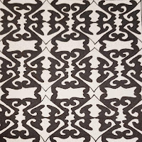
End of Semester Reflection for Junior Year Takeaways from the 5 Guarantees Technology e-Communication has five guarantees of success: technology, collaboration, communication, project management, and leadership. When it comes to the area of technology, I knew everything needed to get started with pattern work. This mainly meant that I could design the icons and symbols for each individual pattern as well as lay them out. I needed to do some learning when all of my layouts were completed, particularly on how to actually create a pattern our of what is on the screen. Even though the steps to make a seamless pattern appeared linear, I struggled with making it all work the way that I wanted it. Many of my patterns did not appear to be seamless, and some occasionally looked off-balance and uneven. Collaboration, Communication, and Leadership For each of the projects that have been done this semester, it has not been particularly easy to go above and beyond on these three gua

Sophomore Graphic Design Reflection

Image
Semester 2 Project Spotlights Personal Logo Designs As the most recent project, the personal logos were one of the more difficult projects to sketch out and execute. I find this because I don't often create something centered around myself. That being said, drawing and writing out these ideas quickly ran my imagination dry, trying to figure out what else to add and how. However, I had eventually came up with 30+ designs, and stuck with the ones that either really it home, or spoke out in volumes in intricacy. When re-creating my originals in Illustrator, I realized how bland or maybe basic some of them had become in a digital format. This could have been from poor color palette or simply from a design choice in itself. However, I did manage to create three overall that meant something to me either in what it represents, or artistic in overall work. Event Advertising (Poster, Postcard, and Ticket) One of the more memorable projects of this year, I had been challenge

Low-Poly Self Portrait

Image
 The Proper Picture Choosing a picture to work off of resorted to searching through my camera roll, eventually finding something that looked good enough to use. It didn't have any distortions or fuzz on the main parts (the face and hair), which was essential to the overall success of the project. Moving it to Photoshop, the size was reduced to an 8x8 in. square, and exported as a PNG or JPG. Illustrator required a new project to be made, containing two art-boards both the size of the edited photo, moving and duplicating it to both areas.  The Creation I decided to create a low-poly portrait because it has always been on my wishlist, never being able to get around to it until this chance had arisen. Going into it there had been thoughts revolving around how complicated it would seem, and constantly worrying about how it would turn out in the end. Working thorough it, the project became a whole lot simpler, as a grid was created and the pen tool was enabled to only snap t

SPGD--Typography

Image
Decisions When going into the project, I was searching for ten quotes for either inspiration, or to do typography work on, and needed at least four to pertain to my everyday thoughts, or events/ activities. So I began searching for quotes pertaining to four things: music, scouting, chess, and life in general. As soon as these were written in my sketchbook, I went for fonts to fit the overall theme of each quote, fonts that represented words or the phrase overall. Some of the chosen fonts were universal in my project, as I used them in almost all of my drafts simply because of how they seemed to work with other words and its environment.  Development I started by creating four art boards, and placing my top four quotes on each one. I then brought up my list of each font that I had downloaded from DaFont.com, and scrolled through each one while my phrase or quote was selected so I could get an overall preview for each one. After deciding on specific fonts, I proceeded to divi

SPGD--First Semester Self-Exam

Image
Highlighted Graphic Design Projects Photoshop Challenge #1--"Nature Man" At the beginning of the year, we were re-introduced to Adobe Photoshop, and had to go through several tutorials to enhance our understanding and capabilities with the software. After these were finished, the class was tasked to use our abilities to create the "Nature Man." This project took about 8 days to complete, start to finish, with a few minor complications in between. These include masking problems, effects errors, and a few visual difficulties in the end. However, I learned how to alter the appearance of the image, without taking away the textures of the original image itself, as well as using some complex effects to complete the hair. Along the way however, I was given advice on how to go complete a function in a new manner to save time overall, most of which related back to masking, and how to properly go about it.  At this point, I was happy with my overall result, as I had

Printing Two of my Recent Projects

Image
 In the Beginning When the assignment came up in class, we were to print two of our projects that we were the most proud of. They were going to be prints of out personal top two picks from our unit in photoshop. The dimensions needed to be an 8in.x10in. in a new photoshop project. After this was finished, our picks needed to be altered to our liking, and transformed to be ale to fit both projects onto one sheet. Now they needed to be flipped horiOnce everything was aligned with even margins, the new project was printed and kept until they were required down the line. Watercoloring Once the projects were put onto paper, we used two pieces of cardstock, and began to create abstract watercolor paintings. When painting, I recalled which parts of the images would be heavily influenced by color. Areas of white become more susceptible to taking in color than colored areas. Colored areas would be emphasized when met with similar color. When finished, these would be left to dry befor

Printing Processes and Techniques

Image
Relief Printing Relief printing was originally for hand pressing, rather than using an actual press. To do the process you would lay a piece of paper over a wood block, in which has an image with ink in cut sections. Beginning to make the block involves painting over it with a light black ink. After, you would lay a template down to draw the outline of the design desired. When carving the wood block itself, various white and black lines would be used to add or remove detail or additional texture to the image for when it transfers over to paper. After carving is completed, an ink roller goes over the block to prepare for pressing the paper. Linoleum cutting is similar to that of wood cutting, except removed material has a white finish, and anything that was left untouched remains black. Any tool that may remove the surface for either method will work for when you print, but blocks must be made backwards in terms of detailing to have a project that makes visual sense.  Intaglio