Posts

Showing posts from January, 2018

Typeface Anatomy

Image
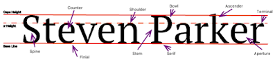
The Project To begin our new kind of "unit", we started to get into fonts, typefaces, and size as well as what they mean or can make the reader feel. For an introductory project, typeface anatomy seemed to fit in. Through this we began to scratch the surface of what typeface anatomy is and sometimes why people study it. To complete the assigned task, we were to give our name, the three major lines, and ten additional typeface components. Overall, by using the line, type, select, and shortcut tools and keys, the project was completed.  Learned Material To start off, I have learned about what major typefaces are as well as various components in Serif based ones. Such as a Serif, which is a protruding segment in a letter, as seen in the example above. They can also make a person feel on edge, relaxed, happy, etc., an example being Comic Sans. Overall, I can remember most of this by the rule that typefaces can say jest as much as words. 

The Color Wheel, A Graphical Project

Image
Project Factors At a Glance... Overall, this project was to help us get accustomed overall to using adobe illustrator. The way that this was done also relates to the learned content over color and schemes. Given this prior knowledge about the color wheel, the hardest part wouldn't be about what color goes where, but rather what tools were needed and how they worked together. This would include all of the shapes seen below, how to change various aspects of the shapes, and finally what text to add (with location). A New Program... In order to bring this idea or assignment into reality, a program called Adobe Illustrator  was used. Compared to Adobe Photoshop, Illustrator was better with graphical design overall, leaving photos to it's companion. Here, a variety of tools are at your disposal, and almost all of them have a unique aspect, from making the interior a new color to changing it completely. That's what the basis was, learn what specific tools are and what c

Logo Color Schemes

Image
Various Color Schemes for Companies Analogous An analogous color scheme consists of three colors that are next to each other on the color wheel. John Deere falls into this category because of it's shadings that help fall into several colors such as green, yellow, and yellow-green. The colors that were used here were probably to give a more visual way to tell that they are a farming or "green" company. PetroChina, a logo that could fall under this category, but also the "warm" category for it's brighter and more summer-like feel by using it's red, orange, and yellow shades. The colors used here were probably used to attract somebody''s attention and give a welcoming or warming welcome.  Complementary A scheme that has two colors used that are directly across each other on the color wheel.  This logo, 7 Eleven, is a representative for the complementary section because of the red and green colors, and yellow being a cl