CSS and CARP Design

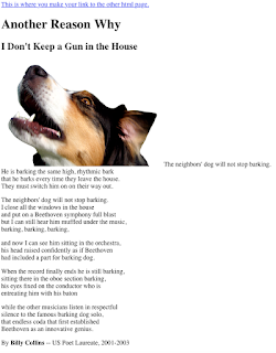
At a Glance Between the two html files, there are evident differences. This includes the background color, text font, size, and color, as well as some layout changes. Then to finish off the project, I added in a link at the top of the page, so that there could be a better comparison between the start and finish. The information that was processed or added into the page would be put into different layout files, so each section would be altered rather than individually bringing out the sections that are wanted to be changed. Contrast The website contrasts consist of the heading, subheading, and body paragraphs. The way contrast was used was by changing the color as well as font size, to lead the eye from the more important parts to the actual cont...

