Posts

A Poster for Oz

Image
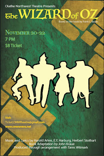
Using CARP to Create a Poster Contrast- Using various sizes and fonts to catch the viewers attention. "The Wizard of Oz" was left as the biggest text on the poster.  The image has contrasting colors compared to the background. Groups of text have a different color based on their subject. Groups of text have different sizing based on importance. Alignment- Keeping lines or images on the same line or axis. The title, studio, details, and information all line up with each other.  The end of the title and the author are aligned. Repetition-  Repeated design ideas. Text groups are small and apply to a specific topic. Lines of three are used in each text group. Different colors apply to a different topic or area of interest. Proximity- The space and grouping between everything. The title, studio, and author are all close together to represent their close ties. All text groups have similar spacing between lines.  Space between ea...

Typeface Anatomy

Image
The Project To begin our new kind of "unit", we started to get into fonts, typefaces, and size as well as what they mean or can make the reader feel. For an introductory project, typeface anatomy seemed to fit in. Through this we began to scratch the surface of what typeface anatomy is and sometimes why people study it. To complete the assigned task, we were to give our name, the three major lines, and ten additional typeface components. Overall, by using the line, type, select, and shortcut tools and keys, the project was completed.  Learned Material To start off, I have learned about what major typefaces are as well as various components in Serif based ones. Such as a Serif, which is a protruding segment in a letter, as seen in the example above. They can also make a person feel on edge, relaxed, happy, etc., an example being Comic Sans. Overall, I can remember most of this by the rule that typefaces can say jest as much as words. 

The Color Wheel, A Graphical Project

Image
Project Factors At a Glance... Overall, this project was to help us get accustomed overall to using adobe illustrator. The way that this was done also relates to the learned content over color and schemes. Given this prior knowledge about the color wheel, the hardest part wouldn't be about what color goes where, but rather what tools were needed and how they worked together. This would include all of the shapes seen below, how to change various aspects of the shapes, and finally what text to add (with location). A New Program... In order to bring this idea or assignment into reality, a program called Adobe Illustrator  was used. Compared to Adobe Photoshop, Illustrator was better with graphical design overall, leaving photos to it's companion. Here, a variety of tools are at your disposal, and almost all of them have a unique aspect, from making the interior a new color to changing it completely. That's what the basis was, learn what specific tools are and what c...

Logo Color Schemes

Image
Various Color Schemes for Companies Analogous An analogous color scheme consists of three colors that are next to each other on the color wheel. John Deere falls into this category because of it's shadings that help fall into several colors such as green, yellow, and yellow-green. The colors that were used here were probably to give a more visual way to tell that they are a farming or "green" company. PetroChina, a logo that could fall under this category, but also the "warm" category for it's brighter and more summer-like feel by using it's red, orange, and yellow shades. The colors used here were probably used to attract somebody''s attention and give a welcoming or warming welcome.  Complementary A scheme that has two colors used that are directly across each other on the color wheel.  This logo, 7 Eleven, is a representative for the complementary section because of the red and green colors, and yellow being a cl...

Basic Website

Image
Dreamweaver On this project, I was assigned to create a website as a final grade for the semester. To do this I used an application called Adobe Dreamweaver. This is essentially a program that enables you to create your own website layout or design, and it could even teach a bit about coding. When starting, I was given a couple of layout files to use for the project, so all that I needed to do was import them from the server folder I have. After this was done, I took a picture of myself and brought it into the layout. Right after this step has been completed, it was time to add in my "Elevator Pitch" by simply pasting it from the drive I kept it in. The projects page was essentially the same thing, taking text from other areas I made, and embedding my videos form YouTube. Now, the finer details, colors were selected by heading into the properties section on the right hand side, and by choosing what to color, you can determine the shade it will turn out to be. Links were ...

Challenge #3, Chase Scene

Image
Pre-Production When developing ideas for the group, it had eventually boiled down to three items, a hall monitor evasion, museum chase, and a school item theft. Each of these were rather unique in their own plan, for instance, the museum chase had a guard and "special item." The hall monitor evasion had some comedy and suspense as well as backtracking. Finally, our school item theft sequence required a thief and student chasing after. Our main conflict when presenting these to each other was who would be what, and how would the theme we want fit in.  Scouting out our Locations When we developed our story, it was time to figure out where to shoot and how many shots there would be. So it started with a basic path to follow, a pod, to a main hallway, commons, another hall, to the stairs, and capture. Once agreed upon, angles and shot sizes were put into order, as well as a clearer sequence. At this time, basic shot locations were determined through our storyline, th...

e9 AB Sequence

Image
Basic AB Sequencing To start off, we needed to get our shot sizes, and make a variety of cuts to make our film faster-paced or intriguing. I decided to think of each of the six shot sizes and what would pair best with our ideas, and later shared them throughout our group and assignment. After that was decided, it was time to determine what sequence would go where, and how we would follow the 180 degree rule. The sequence of events is shown in the video, and how we trie to keep an organized video is through the camera location. We also added in an obstacle, in this case an acting hall monitor, to give an element of sudden suspense.  From Planning to Filming In the beginning of this project, our group originally had a completely different idea involving a hall monitor, but it started to become a chase scene instead of the assigned AB sequenced video. So when we ran through a new idea, it came to life only when we pressed the record button. We knew we wanted our obstacle or...